Power BI Customization
Your company has a unique way of defining important data and asking questions that can be answered with data. You may already have someone who is tech and data savvy that has developed great looking excel visuals. As they know, it is time-consuming to extract and format data so customizing Power BI data may be a massive time saver. For data nerds, this type of project can be exciting and beneficial to everyone involved.
If you already have a custom dashboard, and you want to know how to access it from within ActionFlow, jump below.
In order to customize dashboards, we provide a basic understanding of:
If you already have a custom dashboard, and you want to know how to access it from within ActionFlow, jump below.
In order to customize dashboards, we provide a basic understanding of:
- Power BI's filter and visualization functions
- Learn how to make changes to the default dashboard
- Learn how to create a dashboard from scratch
- the ActionFlow Power BI data structure
Power BI Customization - Making Changes to the Default Dashboard
This video demonstrates how to make changes to the default dashboard provided by ActionFlow.
NOTE: If you save a copy of the default dashboard and make changes, you will NOT get updates that we make to filters or visuals. We recommend only customizing the default dashboard if you have many significant changes in how you want to think about or view the visuals we provide. The underlying data will stay consistent so if you are happy with the dashboard as is and aren't concerned about potential future updates, this may still be a great option for you.
Alternatively, you could create an entirely new custom report (see video below) if you are looking for new visuals and then reference both your single report and the default dashboard we provide.
|
Power BI Customization - Building Dashboards from Scratch
You can build ActionFlow Power BI dashboards from scratch by tapping into the Data Model and creating your own visuals. This may be useful if the default dashboard does not have a visual close to what you are trying to display. This may also be useful if you are trying to organize pages or visuals to limit access for certain users or break out topics like "Sales" or "Installs and Templates" more clearly.
When Power BI opens, you can access the data model by clicking "Get Data" and selecting "Azure Analysis Services database" and inputting the following information:
Server: asazure://centralus.asazure.windows.net/aflowas
Database: PowerBI_ActionFlow
Live Connection
If you would like to format your dashboard similarly to the default dashboard, you can use the "Starter Template" provided.
|
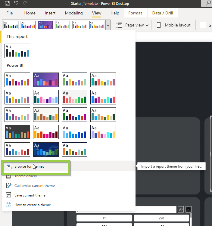
You can also download the theme which will also help in matching the default dashboard formatting. See the image to the right to show how to add this downloaded theme to your report.
|
| ||||
ActionFlow Power BI Data Structure
This video provides a general overview of ActionFlow's Power BI data model which can help in understanding how current visuals are created and how you may design future visuals.
|
|
Dates in Power BI
In order to drill down and filter on dates, we create a date dimension table behind the scenes which links a number like 20220215 to fields: "2-12-2022," "February," "2022," "15" etc.
When we want to filter the Job History table on Date Completed, we reference the date dimension table behind the scenes in order to quickly link the 8-digit "Date Completed" number to the various elements of the date. |
|
Job History vs Job Actions
We since added a new table called "Job Actions." If you want to filter or look up information related to Actions, you want to use this table.
The "Job History" table is used behind the scenes to filter on when jobs changed from one status to the next. This table is a high level approach that is not intended to be used for key visuals. |
|
